Posts
3361Following
126Followers
700I try to be very careful about CWing things. sometimes I make mistakes but I want to make my posts as safe to read as possible
I sometimes post NSFW/kinky/lewd things behind CWs. this should go without saying but if you're a minor please do not interact with anything lewd/NSFW that I post
I have very limited energy and am very shy so it might take me a long time to reply to messages sometimes, or I might not be able to reply at all. this is kind of an "output only" account for the most part, but I'm hopeful that I can change that over time
I sometimes use curly braces to {clearly show where a grammatical phrase begins and ends}, like that. you can think of them like parenthesis in code or math, except they operate on grammar instead

kasdeya
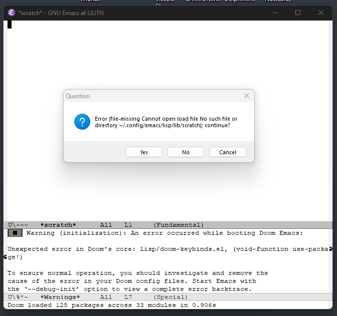
kasdeya“well I think I’m learning that Neovim is not nearly as stable as I’d like, but I wonder if Emacs is any better”
Emacs:
 2
2
 0
0
 6
6
kasdeya
kasdeyaShow content
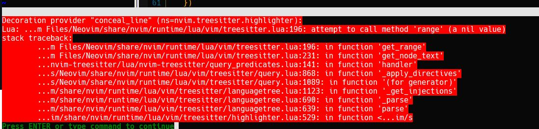
amazing how often the neovim ecosystem will silently break my config and leave me digging through the internals to figure out how to fix it
currently trying to figure out why this (see pic) happens every time I open certain types of windows, and then breaks all of my highlighting
and this is after I fixed my Lua LSP config which was broken by… something, at some point. I’m so tired of this shit. I just want an editor that works
 1
0
1
1
0
1
kasdeya
kasdeya


 1
0
6
1
0
6


kasdeya
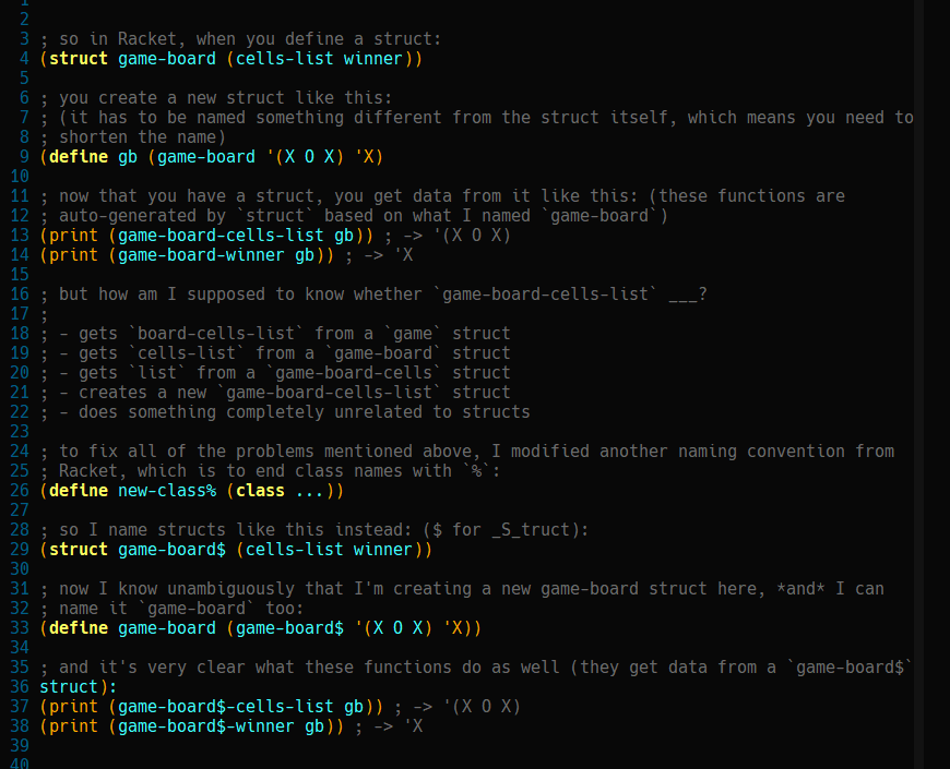
kasdeyaI’m pretty proud of myself for solving a problem that Racket folks apparently never even considered, or couldn’t solve on their own
 0
0
5
0
0
5


kasdeya
kasdeyaShow content
@FoxFux I feel like I was made for this bingo lol
RE: https://kinkycats.org/@FoxFux/116038679929270686
 5
0
7
5
0
7