Vile Lasagna
VileLasagna@mastodon.gamedev.place
It feels like the further we go along, the worse websites get. Not just with the whole "i dunno, just load 200MB of Javascript to display coloured text" but also the web design has been steadily getting worse and worse
Feels like we peaked around information layout and clarity sometime 10+ years ago and, for some reason, just decided to make pages increasingly obtuse
Take these docs I need to read for example. Nice big font, bright and contrasty standard etc.... but then there's a list [+1]
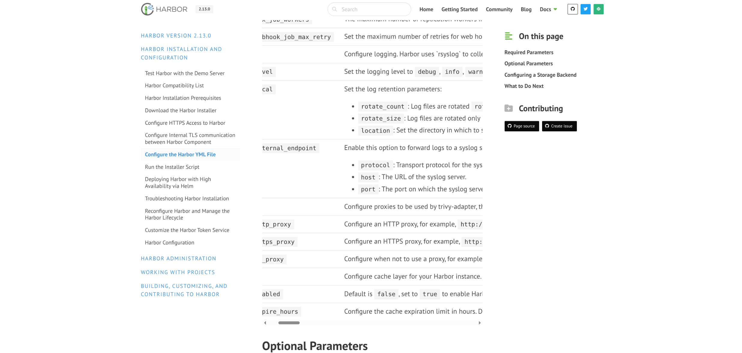
 2
2
 0
0
 1
1
Vile Lasagna
VileLasagna@mastodon.gamedev.place
This is a list of various parameters for configuring stuff and what they mean... stuff you WANT in docs. But it gets put in this scrollable box so you can't read all the things... The box's scrollbar is fixed to the bottom so you can't scroll it while looking at an item near the top, and it's all so tiny in the middle column that you can barely read any entry... Awful stuff [+1]
1
0
1
Vile Lasagna
VileLasagna@mastodon.gamedev.placeBut there's also like tons of unused space on either side in this 16:9 monitor which you'd assume is the standard these days! Can't use THAT for some reason
That space needs to be empty so the list is unreadable for weirdly manufactured reason. Just stretch things to the side and it's 70% better even if the whole scrollable box doesn't work well in context...
It's just unforced error after unforced error, every page has ONE thing like this, it's exhausting [/rant]
0
0
1
Vile Lasagna
VileLasagna@mastodon.gamedev.place@rowan we're still open to suggestions. Just need a registry that we can hook to LDAP and whatnot
1
0
1
eli (ˈe̝ːli), vampire kitsune
rowan@VileLasagna if you’re already hosting gitlab/gitea/forgejo, that has a built in container registry – otherwise, harbor is unfortunately probably your best bet 
1
0
0
eli (ˈe̝ːli), vampire kitsune
rowan@VileLasagna (my original post wasn’t meant to be a critique of your decision, i just really hate Modern Software)
1
0
0
Vile Lasagna
VileLasagna@mastodon.gamedev.place@rowan Eh, I get it. I too am a computer toucher and, thus, constantly in frenzied anger u.u
0
0
1