kasdeya
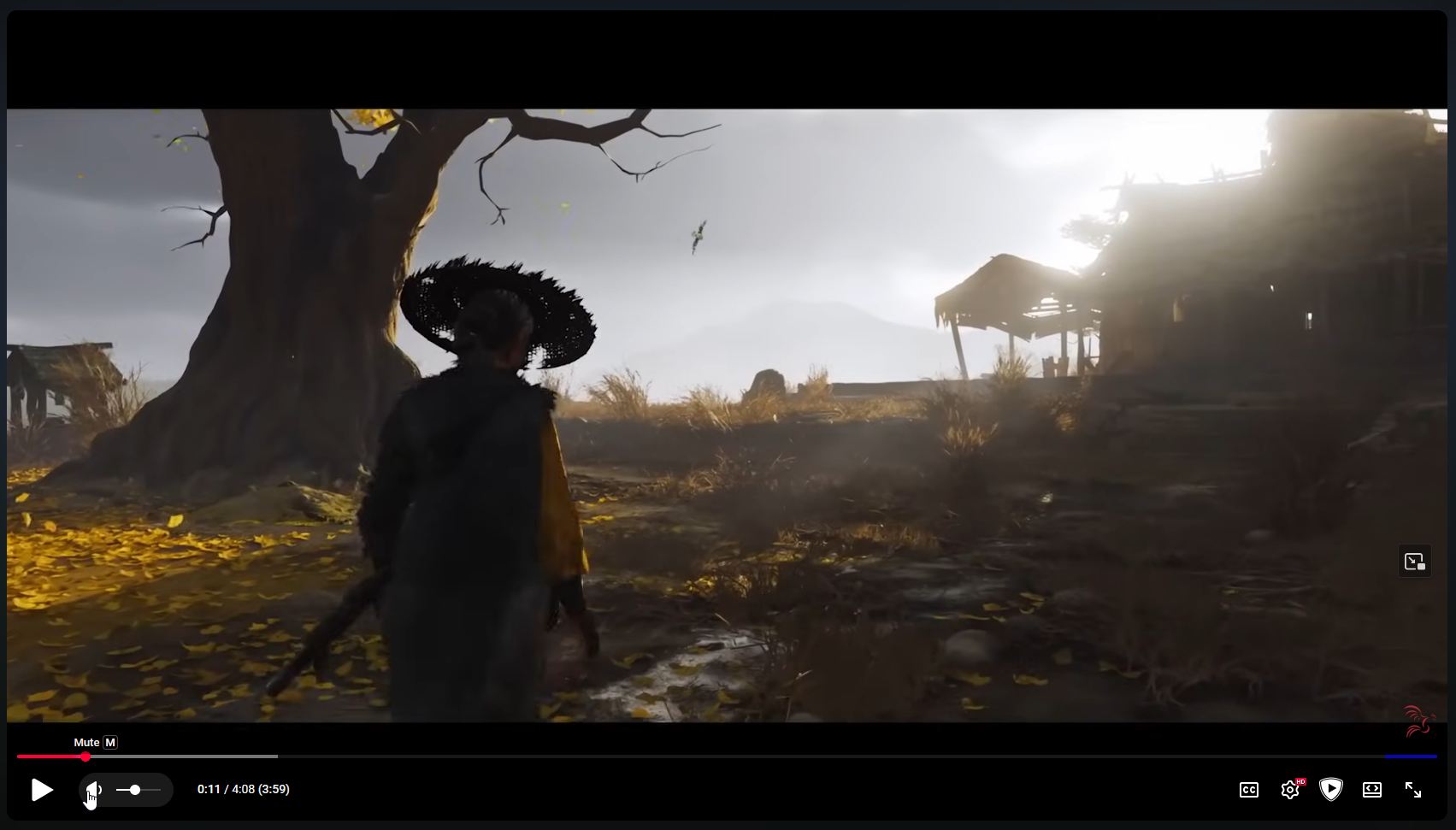
kasdeyawhat the fuck did they do to the youtube UI
why do corpos always do this constant UI churn instead of fixing or improving anything
kasdeya
kasdeyaa pretty UI is only pretty until people get used to it. then you have to redesign it so it seems pretty again
an ugly, utilitarian, bare-practicality UI is only ugly until people get used to it, and then it’s utilitarian and practical forever
tempest
tempest@social.treehouse.systems@kasdeya we disagree, but largely because we think "pretty" is subjective and more to do with an individual's specific tastes
we believe it is more accurate to describe corporate redesigns as making a UI more marketable, rather than more pretty — after all, beauty and taste *can* be lasting
as an example, personally we still quite like the design cues of vista-era designs, and we appreciate some (but not all) of the aesthetics of material-like drop shadow styles . . . but neither of those are currently trendy or marketable in current corporate design. at the same time we do like (some) of the aesthetic cues of the current glassy surface trend (although we're sure we will be tired of them being overdone in a year or two, even if we find them pretty)
. . . with that said, replace "pretty" with "marketable" and we are 100% behind your point, we're just feeling wordy and particular
kasdeya
kasdeya@tempest hm that’s fair! it definitely makes sense that the corporate UI churn is because of marketability instead of aesthetics
I do think that, at least for me, I get used to any UI that I use for too long - no matter how much I like it at first. for example I used to love Akkoma’s UI so much that I gushed about it for several days in a row lol. but now since I’ve been using it every day for a few months, it just seems normal to me and I don’t really get any joy out of it visually
but with that said, I do still like other UIs that are designed in a similar way to how Akkoma looks (boxy Windows 98/95 looking UIs) - it’s really just Akkoma itself that I’m used to now
Tropical Trevor
tropicaltrevor@mas.to@kasdeya @tempest I can't help myself and say that getting used to things is the best UI. If you have 5 nested menus to click through, I have muscle memory. The fad, to me, seems like selling the new thing rather than UI design. I freakin hate the flat monocolour icon vibe we have these days... When Google made all their apps the same 3 colors in different shapes, everyone followed, and I keep opening the wrong app since. Sorry for the rant, I am unhinged about this and fuck uniform icons PROTON
