kasdeya
kasdeya
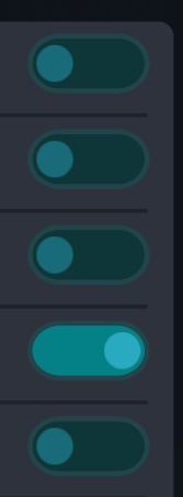
I hate this UI element so much. I can never tell if it’s supposed to be on or off. like I know it changes color but does the slightly darker teal mean “on” or does the slightly lighter teal mean “on”? does left mean on or does right mean on? and every UI has a different set of colors to mean “on” and “off”. it drives me crazy
please just use checkboxes
 2
2
 0
0
 10
10
和地城乃ダニエル
Kazunodan@famichiki.jp
@kasdeya
I think lighter colour means "ON". But yeah, I agree it's not incredibly intuitive. A check box would do just fine
0
0
1
Ray McCarthy
raymaccarthy@mastodon.ie@kasdeya
Yes, UI design has gradually gone downhill 1993 to 2003.
Dropped rapidly in 2006.
Fell off a cliff in 2015.
Win 10 & Android UI elements are stupid.
Is something text, a link to web, a button or something else?
Hiding or skinny scroll bars.
Edges to drag that feel like 1 pixel.
No X (close) on a dialog, just click/tap outside window.
Same app, but some screens need Save pressed (scroll down to see) & others update as you change.
Are idiots designing UI?
Apps/programs that ignore system
0
0
0